I occasionally have the same back-and-forth with a colleague in work (let’s call him Tim) who insists that everything we build should only be designed and built using System Fonts, citing poor performance and bloat as a reason not to use Web Fonts.
Now, while I agree with Tim that we should use System Fonts in lieu of Web Fonts wherever possible, I disagree that Web Fonts can be a problem - it’s just Tim’s implementation of them that’s slow and bloated. So let’s look at my preferred way of loading up Web Fonts into the client that doesn’t trash your site’s performance.
What’s the problem?
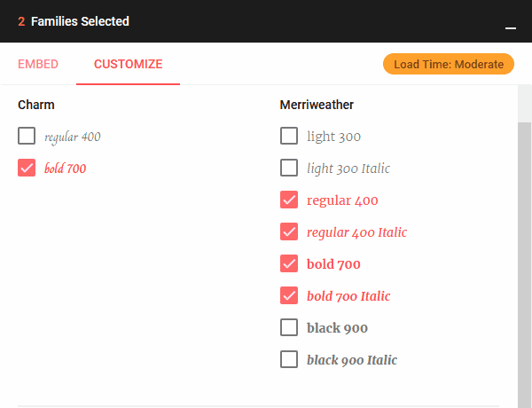
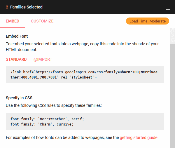
As I said, Web Fonts can be a problem because it’s so easy to get them into a page. Let’s take a look at building out a simple, content-heavy page. We’re going to use Charm Bold (700) for headings, and Merriweather for body content and, since it’s for body content, its Regular (400), Regular Italic (400i) Bold (700), and Bold Italic (700i) variants will be required - all from Google Fonts.
For the most part, you could be forgiven for taking Google’s advice to just put their
link tag on the page, update your CSS, and go home but this can be tremendously costly
to your page performance.
The above fonts add four additional network requests in the background for font files,
which is fine in itself, but the CSS provided now ties your site’s font-family into
these fonts which will take time to download - which could be substantial on mobile - and
cause visitors to not see any content on the page until they’re downloaded. AKA: Flash
of Invisible Text (FOIT).
Making it better
So, let’s tackle Tim’s concerns head-on! The approach I’m going for will make use of the Flash of Unstyled Text (FOUT) approach which is relatively straight-forward to implement and, if you need to gain favour, should net you a quick win on your performance metrics.
The approach goes a little something like this:
- Load the fonts as normal with the
linktag. - Apply the font-family property, but behind an additional class on the document
(
has-fonts, in this example). - Attach listeners for when the Web Fonts successfully download.
- Apply the necessary class to the document to apply the font-family styles.
To help us out, We’re going to reach out for a small library called FontFaceObserver which is only 1.3KB gzipped, and will work not only with Google Fonts, but any webfont service.
Once you have it installed in your project, it’s time to move our font-family declarations
behind the has-fonts class we plan on using.
<style>
  html.has-fonts {
    font-family: 'Merriweather', serif;
  }

  .has-fonts h1,
  .has-fonts h2,
  .has-fonts h3,
  .has-fonts h4,
  .has-fonts h5,
  .has-fonts h6 {
    font-family: 'Charm', cursive;
  }
</style>
This has stripped us of our web fonts, but now let’s add in the observers for each of the font families. We’re going to do this all after the document has loaded, which is what will allow us to render our content while waiting for the Web Fonts to download.
<script>
  // Set up Observers on the most important fonts we want.
  // By default, these will only watch for the 'normal' weight to complete, which is OK
  // for us because the majority of our content is in that weight. If we wanted to wait
  // for Bold and Italic, we could always just add new watchers!
  const Charm = new FontFaceObserver('Charm');
  const Merriweather = new FontFaceObserver('Merriweather');

  // The `.load()` method returns a Promise that we can use with `Promise.all()` to await
  // all expected fonts and act upon them.
  const fonts = [Charm.load(), Merriweather.load()];

  window.addEventListener('load', () => {
    Promise.all(fonts).then(() => {
      // Once all the Promises have resolved, add our class to the `html` tag!
      document.documentElement.classList.add('has-fonts');
    });
  });
</script>
The above code is about all we need to accomplish our FOUT, and allow the user to see content on their device immediately without having to wait for network requests.
Next steps
As I mentioned above, this is a great way to see some immediate performance benefits if your site does make use of Web Fonts, but it does definitely have its downsides. For example, because we present content immediately the user eventually recieves a repaint and content shift when the new font is applied which can be a pretty jarring experience.
This can be mitigated to an extent by matching the line-height and letter-spacing of
your System and Web Fonts - Monica Dinculescu has an excellent font-style-matcher
tool to help you not want to gouge your eyes out.
Another option available is font-display with a value of swap or fallback. This
is the ideal, pure CSS solution, but doesn’t work in IE or Edge (as of writing). It also
has a caveat in that it must be included inside the @font-face at-rule, meaning if you
decide to use a service like Google Fonts, you can’t use it since you don’t control those
at-rules.